
Simple UX Fixes That Instantly Improve Your Squarespace Site
A visitor does not need five minutes to judge your website. Most people decide much faster. They land on your Squarespace site, scan the first screen, tap the menu, check if the page feels easy, and decide whether to stay or leave. That decision often happens before they read your best copy, view your services, or reach your contact form.
That is why small user experience changes matter so much.
A Squarespace site can look clean and still feel hard to use. The text may be too small on mobile. Buttons may sit too low on the page. The menu may have too many choices. Images may slow down the page. A contact form may ask for too much information. None of these issues feel huge on their own, but together, they make visitors work harder than they should.
The good news is that you do not always need a full redesign. Many sites can improve fast with simple UX fixes. These changes help visitors move through your site with less friction. They also support better trust, stronger engagement, and more leads.
Squarespace already uses responsive design that adjusts content and images for different devices and screen widths, but that does not mean every page will feel perfect on mobile by default. Spacing, content order, button placement, and section length still need careful review. Squarespace also notes that mobile padding can behave differently from desktop spacing, so mobile checks are important before publishing.
This guide covers practical UX improvements you can make to a Squarespace site without overcomplicating the process. Some are easy UX fixes you can apply today. Others may need a designer or a team like Pocketknife if your site has deeper layout, branding, or conversion issues.
Why Simple UX Fixes Matter for Squarespace Websites
User experience is not only about how a website looks. It is about how easy the site feels to use. A good Squarespace website should help visitors understand where they are, what you offer, why it matters, and what they should do next.
Many business owners focus first on colors, fonts, and images. These are important, but they are not enough. If visitors cannot find your services, read your text, tap your buttons, or trust your page, the design is not doing its job.
UX affects first impressions
Your homepage is often the first place people meet your brand. If the page looks busy, unclear, or slow, visitors may leave before they learn anything useful. A clear layout helps people feel calm. A strong heading tells them they are in the right place. A visible button gives them a next step.
Simple UX fixes help your site answer three quick questions.
What is this business?
Can it help me?
What should I do next?
When your website answers those questions fast, visitors feel more confident. That confidence can lead to more clicks, more form submissions, and more calls.
UX affects search performance
Google’s Core Web Vitals measure real user experience signals related to loading performance, interactivity, and visual stability. Google recommends that site owners work toward good Core Web Vitals because they support better user experience and can help with Search success.
This does not mean UX alone will make a page rank. Content quality, relevance, links, local signals, and technical SEO also matter. Still, poor page experience can make SEO work harder. If people land on a page and leave quickly because it feels slow or confusing, that is not good for business.
UX improvements and SEO often support each other. Clear headings help readers and search engines. Better internal links help visitors and crawlers. Faster pages help users and search performance. Strong mobile design helps almost every part of the customer journey.
UX affects conversions
A conversion does not always mean a sale. It can mean a form fill, booking, call, email click, product view, quote request, or newsletter sign up. Every website has a goal, and UX decides how easy that goal feels.
A visitor may want to contact you, but if the form is hidden, they may leave. A shopper may want to buy, but if product details are unclear, they may pause. A client may want to compare your services, but if the pages are messy, they may choose someone else.
This is where Pocketknife can be useful for businesses that want more than a nice-looking Squarespace site. A good UX review finds small points of friction that stop visitors from taking action.
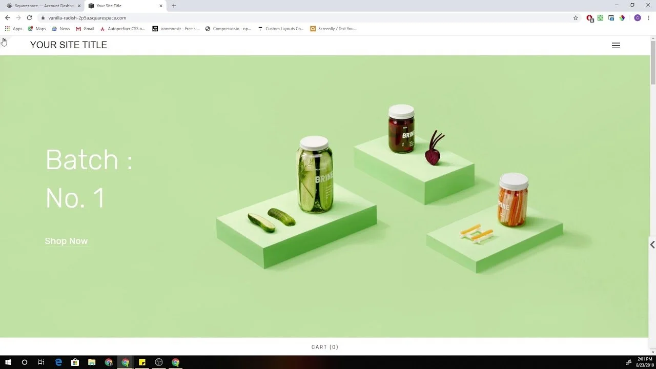
Start With a Clear First Screen
The first screen of your site has one job. It should tell visitors what you do and why they should keep reading.
Many Squarespace websites waste this space. They use vague headlines, large decorative images, or sliders that do not explain the business. A pretty first screen may look good, but if it does not guide the visitor, it becomes a missed chance.
Write a direct hero headline
Your main headline should be simple. It should say what your business does in plain language. Avoid clever lines that sound nice but say very little.
A weak headline might say:
“We help brands grow beautifully.”
A stronger headline might say:
“Squarespace Website Design for Service Businesses That Need More Leads.”
The second version is clearer. It tells the visitor what the company does, who it serves, and why it matters.
For a service business, clarity beats cleverness. Visitors should not have to guess. If your site sells products, say what type of products you sell. If your site promotes services, say who the services are for. If your site is built to generate bookings, make that clear early.
Add one strong supporting sentence
Your headline should be followed by a short sentence that gives more context. This sentence should explain the outcome, process, or value.
For example:
“We design clean, easy-to-use Squarespace websites that help visitors find your services, trust your brand, and contact you faster.”
This kind of sentence supports both UX and conversion. It tells people what they can expect without using heavy language.
Keep the main button visible
Your first screen should include one clear call to action. This could be “Book a Call,” “Get a Quote,” “View Services,” or “Start Your Project.”
Do not place too many buttons side by side. Two buttons can work if they serve different visitor intents, such as “View Work” and “Book a Call.” But three or four buttons can create doubt.
One of the easiest simple UX fixes is to make your main button visible without scrolling. Many Squarespace sites hide the main action too far down the page. Move it up. Use clear button text. Make it easy to tap on mobile.
Improve Mobile UX Before Desktop Details
Most visitors will likely view your site from a phone at some point. Even if your customers first discover you on desktop, they may return from a mobile browser, email link, social profile, or local search result.
Squarespace’s responsive design helps pages adjust across devices, but layout checks are still needed because content can stack, resize, or shift differently on smaller screens.
Check the mobile version page by page
Do not only check your homepage. Review every key page on mobile. Look at your service pages, about page, contact page, blog posts, product pages, and booking pages.
Read the page like a real visitor. Check if the headline appears clearly. Check if the first button is easy to reach. Check if images take too much space. Check if sections feel too long. Check if forms are simple enough to complete on a phone.
This process can reveal issues that are easy to miss on the desktop.
Make tap targets easy to use
Buttons and links should be easy to tap with a thumb. If links sit too close together, visitors may tap the wrong item. If buttons are too small, they feel annoying. If your navigation menu has too many items, it becomes harder to use on a phone.
One easy UX fix is to simplify your mobile menu. Keep the most important links. Use clear labels. Put contact, booking, or quote links where visitors can find them fast.
Reduce mobile text blocks
Large text blocks feel heavier on mobile. A paragraph that looks fine on desktop can feel long on a phone screen.
Break long sections into shorter paragraphs. Use clear H3 headings. Add space between ideas. Keep each paragraph focused on one thought.
This does not mean your content should be thin. It means your content should be easier to read. A detailed article or service page can still feel smooth if the layout supports scanning.
Avoid mobile layout crowding
Squarespace pages can look polished on desktop but crowded on mobile. This often happens when images, buttons, headings, icons, and text stack too tightly.
Review spacing between sections. Add breathing room where needed. Remove elements that do not help the visitor. Do not force every desktop design idea into the mobile version.
Improving mobile UX is often about removal, not addition.
Simplify Your Navigation Menu
Your menu should help visitors move. It should not make them think too hard.
A common mistake is adding every page to the main navigation. This creates clutter. Visitors see too many choices and may not know where to go next.
Keep top-level menu items limited
For many business websites, five to seven top-level menu items are enough. You may need fewer.
A clean menu might include:
Home
Services
Work
About
Blog
Contact
If you have many services, use a clear services page with internal links instead of stuffing every service into the top menu. If you run an online store, organize products by categories that match how customers shop.
Use familiar menu labels
Avoid unclear labels like “Solutions,” “Experience,” or “Explore” unless they truly fit your audience. Most visitors understand labels like Services, Pricing, Portfolio, About, Contact, Blog, and Shop.
Simple labels improve confidence. They also reduce the time it takes for people to find the right page.
Put the main action in the header
If your goal is leads, your header should include a contact or booking button. If your goal is sales, it should include shop or cart access. If your goal is appointments, it should include a booking link.
This is one of the most useful UX improvements for Squarespace service sites. Visitors should not need to scroll to find the next step.
Make Your Pages Easier to Scan
People do not read websites like books. They scan first. Then they decide what deserves full attention.
A good Squarespace page helps scanners. It uses clear headings, short paragraphs, helpful section order, and visual breaks.
Use headings that explain the page
Headings should not be vague. They should tell visitors what each section covers.
Instead of:
“Our Process”
Try:
“How We Build a Squarespace Site That Is Easier to Use”
Instead of:
“Why Us”
Try:
“Why Businesses Choose Pocketknife for Squarespace UX Improvements”
Descriptive headings improve readability and help search engines understand the page. They also help visitors jump to the parts they care about.
Use one idea per section
Each section should have one clear purpose. Do not mix service details, brand story, pricing, testimonials, and contact copy all at once.
A clean service page might follow this order:
What the service is
Who it is for
What problems it solves
What is included
How the process works
Proof or examples
Call to action
This order feels natural. It answers questions step by step.
Add helpful internal links
Internal links guide visitors to related pages. They also help spread SEO value across your site.
For example, a blog post about easy UX improvements could link to a Squarespace website audit page. A service page could link to a portfolio page. A pricing page could link to a FAQ page.
Do not overdo it. Add links where they help the reader take the next logical step.
Fix Weak Calls to Action
A call to action tells visitors what to do next. It should be clear, specific, and placed at the right moment.
Weak CTAs are one of the most common UX issues on Squarespace websites. Many sites use unclear button text like “Learn More” everywhere. That may be fine sometimes, but it is not always strong enough.
Use action-based button text
Your button text should match the action visitors are about to take.
Use:
Book a Call
Request a Quote
View Website Packages
See Our Work
Start Your Squarespace Audit
Contact Pocketknife
Avoid vague labels when a stronger option is available.
Good button text reduces doubt. Visitors know what will happen after they click.
Improve Page Speed Without Ruining Design
A slow website feels frustrating. Visitors may not wait, especially on mobile.
Google’s page experience guidance includes Core Web Vitals and other user-focused checks. Google also explains that page experience is not the only ranking factor, but it can support success when many pages offer useful content.
Squarespace handles hosting and many technical items for you, but you still control many parts of page weight. Images, videos, scripts, animations, and third-party tools can slow things down.
Compress large images before uploading
Large image files are a common reason pages feel slow. Uploading full-size images straight from a camera or design tool can add unnecessary weight.
Resize images before uploading. Use the right image size for the page. Avoid using a huge image where a smaller one would look the same to the visitor.
Also give images clear file names and alt text. This helps with accessibility and image SEO.
Use video carefully
Background videos can look attractive, but they can also slow a page. If a video does not help the visitor understand your offer, remove it or move it lower on the page.
For service businesses, a clear headline and strong proof often work better than heavy video backgrounds.
Limit extra scripts and plugins
Third-party tools can add weight. Chat widgets, analytics scripts, popups, review widgets, booking tools, and tracking pixels may all affect performance.
Use only what you need. If a script does not support sales, leads, tracking, or customer support, consider removing it.
Test important pages
Use tools like Google Search Console’s Core Web Vitals report to check real user performance data where available. Google says this report is based on real-world usage data.
Do not only test your homepage. Test the pages that matter most for leads and sales. A fast homepage is helpful, but your service page, product page, or contact page may be where visitors decide to act.
Clean Up Your Visual Hierarchy
Visual hierarchy means the order your eyes follow on a page. A strong page makes the most important items stand out first.
Poor hierarchy makes everything feel equal. When everything shouts, nothing feels important.
Make headings clearly different from body text
Your H1 should look like the main page title. Your H2 headings should separate major sections. Your H3 headings should support smaller ideas.
Do not use the same size and weight for every text style. Visitors need visual signals.
Squarespace makes it easy to adjust font styles, but consistency matters. Set styles once and use them across the site.
Use contrast for important actions
Buttons should stand out from the background. If your button color is too close to the section color, visitors may miss it.
This does not mean every button must be bright. It means buttons should be easy to notice. Use contrast, spacing, and clear text.
Remove decorative clutter
Icons, shapes, dividers, and background patterns can add style, but they should not distract from the message.
Ask one simple question for each design element.
Does this help visitors understand or act?
If not, remove it.
This is one of the easiest UX fixes because it costs nothing. A cleaner page often feels more professional.
Make Forms Shorter and Easier
Forms are where many conversions fail. A visitor may be ready to contact you, but a long or confusing form can stop them.
Ask only for what you need
For a first contact form, you may only need name, email, message, and one project detail. If you ask for budget, timeline, phone number, company size, service type, and many other fields, some visitors may quit.
You can collect more details later.
A shorter form feels easier. It also respects the visitor’s time.
Use clear field labels
Do not use confusing field names. Keep labels simple.
Use:
Name
Email
Website URL
What do you need help with?
When would you like to start?
Avoid labels that feel stiff or unclear.
Add a friendly note near the form
A short note can reduce doubt.
For example:
“Tell us what you need help with. Pocketknife will review your message and reply with the next best step.”
This tells visitors what happens after they submit. That small detail can make the form feel safer.
Test the form on mobile
Fill out your own form from a phone. Check if fields are easy to tap. Check if the submit button is visible. Check if the confirmation message appears clearly.
Many form issues only show up when you test them like a real user.
Use Trust Signals Where Decisions Happen
Trust signals help visitors feel more comfortable choosing you. These can include testimonials, case studies, client logos, reviews, awards, certifications, project results, or clear process details.
But trust signals should be placed carefully. Do not hide all proof at the bottom of the page.
Add proof near service claims
If you say you help businesses improve conversions, show a result or example near that claim. If you say your process is simple, explain the steps. If you say you work with certain industries, show relevant projects.
Visitors should not have to search for proof.
Use testimonials with context
A generic testimonial is better than nothing, but a specific one is stronger.
Weak testimonial:
“Great service. Highly recommended.”
Stronger testimonial:
“Pocketknife helped us clean up our Squarespace service pages, improve mobile UX, and make the booking path easier for clients.”
The second version tells visitors what changed. It supports a buying decision.
Add a short process section
Many visitors hesitate because they do not know what working with you looks like. A simple process section can help.
For example:
First, we review your current Squarespace site.
Then, we identify UX issues that affect trust and conversions.
Next, we update layout, copy flow, mobile spacing, and calls to action.
Finally, we test the site and refine key pages.
This turns an unknown service into a clear path.
Improve Content Clarity
A website can have good design and still fail because the copy is unclear. Visitors need plain words. They need direct answers. They need to know why your offer matters.
Replace vague copy with useful copy
Many websites use broad claims that sound good but do not explain much.
Instead of:
“We create meaningful digital experiences.”
Use:
“We design Squarespace websites that are easier to read, easier to use, and easier to contact from mobile.”
The second line is more useful. It tells visitors what they get.
Explain benefits after features
A feature tells what something is. A benefit tells why it matters.
Feature:
“Mobile-friendly layout.”
Benefit:
“Visitors can read your content, tap buttons, and contact you without pinching or zooming.”
You need both. Features help people compare. Benefits help people care.
Write for real people
Use simple words. Keep sentences clear. Avoid heavy industry terms. Do not try to sound bigger than the business needs to sound.
A good UX copy feels helpful. It does not make visitors decode your message.
Fix Image Placement and Size
Images shape how a Squarespace site feels. Good images support the message. Poor image placement can slow reading, crowd the page, or distract from the action.
Use images with a purpose
Every image should do at least one job. It can show your product, show your work, show your team, create mood, explain a process, or support trust.
Avoid using stock images that feel too generic. They may make the site look polished, but they can also make the brand feel less real.
Do not let images overpower content
Large images can create impact, but too many large image sections can bury the message. On mobile, this problem becomes worse because visitors may scroll through images before reaching useful text.
Review the page order. Make sure important copies appear early enough.
Add alt text naturally
Alt text helps describe images for accessibility and can also support SEO. Keep it natural and accurate. Do not stuff keywords.
For example:
“Pocketknife Squarespace homepage design on laptop screen”
This is better than forcing every keyword into the image description.
Make Your Contact Path Obvious
A visitor should never have to search hard for your contact option. If your site is meant to generate leads, the contact path should be clear on every page.
Add contact links in key places
Your header should include a contact or booking link. Your footer should include contact details. Service pages should include CTAs. Blog posts should guide readers to a related service.
Do not rely only on a contact page link hidden in the menu.
Show what happens next
People are more likely to contact you when they know what to expect.
Add a simple note such as:
“After you submit the form, we will review your site and reply with clear next steps.”
This is especially helpful for service businesses, consultants, agencies, and Squarespace website design companies.
Use a helpful footer
A footer is not just a place for legal links. It can help visitors who reach the bottom of the page.
Include your main services, contact link, social links, location if relevant, and a short CTA. Keep it organized and easy to scan.
Make Blog Posts Easier to Read
If your Squarespace site has a blog, UX matters there too. A hard-to-read blog can lose visitors even if the topic is strong.
Use a clear intro
Start with the reader’s problem. Explain what the post will help them understand. Avoid long background sections before the useful content begins.
A good intro tells readers they are in the right place.
Break content into useful sections
Use H2 and H3 headings to organize ideas. Keep paragraphs short. Add examples where helpful.
A blog post about simple UX fixes should not only list tips. It should explain why each fix matters and how the reader can apply it.
Add Better Service Page Structure
Service pages are often the most important pages on a business website. They need to educate, build trust, and guide visitors toward action.
Start with the problem
Before talking about your service, explain the problem your visitor may have.
For example:
“Many Squarespace websites look clean but still lose leads because the page flow is unclear, buttons are hard to find, or mobile sections feel crowded.”
This shows that you understand the visitor’s situation.
Explain the service clearly
After the problem, explain what the service includes.
For example:
“Pocketknife reviews your Squarespace site structure, mobile layout, content flow, calls to action, and key conversion paths. Then we make practical UX improvements that help visitors move through the site with less friction.”
This is simple, direct, and helpful.
Add who it is for
Visitors want to know if the service fits them.
A section like this can help:
“This service is useful for consultants, local businesses, creative studios, online service providers, and small teams that use Squarespace but need better lead flow.”
This improves relevance and reduces wasted inquiries.
End with a clear CTA
Do not end a service page with a weak closing line. Give visitors a next step.
Use:
“Book a Squarespace UX Review”
or
“Talk to Pocketknife About Your Website”
Make the action clear.
Avoid Common Squarespace UX Mistakes
Some Squarespace mistakes are easy to fix once you know where to look.
Too much content above the fold
The first screen should be clear, not crowded. Do not add a long paragraph, multiple buttons, badges, icons, and a large image all at once.
Use a strong headline, short support text, and one clear action.
Too many font styles
Using many fonts or text styles can make the site feel messy. Stick to a small set of styles and use them consistently.
Consistency helps visitors understand the page faster.
Hidden pricing or unclear offers
Not every business needs public pricing, but every business needs clear offer details. If visitors cannot understand what you sell, they may leave.
You can provide package ranges, starting prices, or service details. The goal is to reduce confusion.
Weak mobile spacing
Mobile spacing can make or break the page. If sections feel too tight, visitors may feel overwhelmed. If sections feel too spaced out, the page may feel slow and empty.
Review each page on a phone and adjust spacing based on real reading flow.
Overloaded homepage
Your homepage should guide people to key areas. It does not need to hold everything.
Use the homepage as a clear overview. Then send visitors to service pages, work pages, blog posts, or contact pages for more detail.
When to Hire A Company
Some easy UX improvements can be done by business owners. You can shorten text, move buttons, simplify the menu, compress images, and clean up sections.
But some problems need deeper help.
Hire help when the site lacks strategy
If your site has pages but no clear path, you may need expert support. Good Squarespace website design companies do more than adjust visuals. They review structure, messaging, user flow, mobile experience, and conversion points.
Pocketknife can help when your site needs a more careful plan, not just surface-level edits.
Hire help when mobile feels broken
If your mobile layout feels crowded, text overlaps, buttons sit in odd places, or sections stack poorly, it may be time to bring in a professional.
Mobile UX often needs careful spacing, section order, and content trimming.
Hire help when traffic does not convert
If people visit your site but do not contact you, the issue may be UX, copy, trust, offer clarity, or page flow.
A UX review can show where visitors may be dropping off and what should change first.
Hire help before a full redesign
A full redesign is not always the first answer. Sometimes a site needs focused UX fixes before bigger design work.
Pocketknife can review your current Squarespace site and help decide whether small improvements are enough or whether a deeper redesign makes more sense.
Simple UX Fixes Checklist for Squarespace Sites
Use this checklist to review your site.
Homepage: Your homepage should explain what you do within the first few seconds. The headline should be clear. The main CTA should be visible. The page should guide visitors to services, proof, and contact options.
Navigation: Your menu should be simple. Use clear labels. Avoid too many links. Put your main action in the header.
Mobile: Review every key page on your phone. Check text size, button spacing, image order, form usability, and section length. Make sure visitors can move through the page without confusion.
Speed: Compress images. Remove tools you do not need. Avoid heavy video sections unless they support the goal. Test important pages with reliable tools.
Content: Use plain language. Write clear headings. Explain benefits. Add proof. Break long paragraphs into readable sections.
Forms: Ask only for needed information. Use clear labels. Test the form on mobile. Add a short note about what happens after submission.
CTAs: Use direct button text. Repeat calls to action at natural points. Match CTAs to visitor intent.
FAQs
What are simple UX fixes for a Squarespace site?
Simple UX fixes are small website changes that make your Squarespace site easier to use. These fixes can include clearer headings, better button text, shorter forms, faster images, improved mobile spacing, and a cleaner navigation menu.
These changes may look small, but they can make a big difference. Visitors should not struggle to understand your services, find your contact page, or read your content on mobile. A good user experience helps people move through your site with less confusion.
For many businesses, simple UX fixes are a smart first step before a full redesign. You may not need to rebuild the whole site. You may only need to fix the parts that slow visitors down or make them leave too soon.
Why does UX matter for a Squarespace website?
UX matters because your website is often the first place people judge your business. If your Squarespace site feels hard to use, visitors may leave before they understand what you offer.
Good UX improvements help visitors find information faster. They also make your site feel more professional and trustworthy. A clear page layout, readable text, strong calls to action, and smooth mobile experience can help turn visitors into leads or customers.
A website should guide people. It should not make them guess where to click or what to do next. That is why user experience is important for both service businesses and online stores.
How can I improve mobile UX on my Squarespace site?
To improve mobile UX, start by checking every important page on your phone. Do not only check the homepage. Review your service pages, product pages, blog posts, and contact page.
Look at text size, button spacing, image size, section length, and menu layout. If visitors need to pinch, zoom, or scroll too much before finding useful information, your mobile UX needs work.
You can also improve mobile UX by shortening long paragraphs, moving key buttons higher, reducing large image blocks, and making forms easier to complete. Mobile visitors want a fast and clear path. Give them one.
What are the easiest UX fixes I can make myself?
Some easy UX fixes can be done without hiring a designer. You can rewrite your main headline to make it clearer. You can reduce menu items. You can change vague button text like “Learn More” to stronger text like “Book a Call” or “View Services.”
You can also compress large images, shorten long text blocks, and remove design elements that do not help the visitor. Another useful fix is to add your main call to action in the header and footer.
These easy UX improvements help your site feel cleaner and more direct. They are a good starting point if your Squarespace site looks nice but does not bring enough leads.
How do I know if my Squarespace site has poor UX?
Your site may have poor UX if visitors leave quickly, do not contact you, or struggle to find key information. You may also notice that your site looks good on desktop but feels crowded or confusing on mobile.
Common signs include small text, weak headings, too many menu links, slow-loading images, unclear service descriptions, hidden contact buttons, and long forms. If people often ask questions that your website should already answer, your content flow may also need work.
A simple UX review can help you find these issues. Pocketknife can review your Squarespace site and show which changes should be made first.
Do simple UX fixes help with SEO?
Yes, simple UX fixes can support SEO, but they are not the only ranking factor. Search engines want to send users to helpful pages. If your page is clear, readable, fast, and easy to use, it gives visitors a better experience.
UX improvements can also help your content perform better. Clear headings make pages easier to scan. Internal links help users visit related pages. Faster images improve page speed. Mobile-friendly design helps visitors stay longer.
Good SEO is not only about keywords. It is also about making the page useful. Simple UX fixes help your Squarespace site serve visitors better.
How often should I review my Squarespace website UX?
You should review your Squarespace UX at least every few months. You should also review it after adding new pages, changing services, updating prices, adding products, or running ads.
Websites can become messy over time. A new section here, a new page there, and soon the site feels harder to use. Regular checks help you keep the site clean and focused.
A good habit is to test your site like a first-time visitor. Open it on your phone, read the first screen, tap the menu, visit a service page, and try to contact yourself. This simple test can reveal many issues.
What makes a strong call to action on a Squarespace site?
A strong call to action is clear, direct, and easy to find. It tells visitors exactly what to do next. Good examples include “Book a Call,” “Request a Quote,” “View Services,” “Start Your Website Review,” or “Contact Pocketknife.”
Weak calls to action often use vague words. A button like “Click Here” does not explain what happens next. A better button tells visitors what they will get after clicking.
Your main CTA should appear near the top of the page, after key sections, and again near the bottom. This gives visitors a clear next step when they are ready.
Should I redesign my Squarespace site or just fix the UX?
You do not always need a full redesign. If your branding still looks good and your site structure is mostly clear, simple UX fixes may be enough. These could include better mobile spacing, clearer copy, improved calls to action, and shorter forms.
A redesign may be needed if your site feels outdated, has messy page structure, weak branding, poor mobile layout, or confusing service pages. It may also be needed if your business has changed and your website no longer matches your offer.
Before spending money on a full redesign, it is smart to do a UX audit. Pocketknife can help you decide whether your site needs small fixes or deeper design work.
Final Thoughts
Good UX does not always require a huge redesign. Many Squarespace sites can improve with simple UX fixes that make pages clearer, faster, easier to read, and easier to act on.
Start with the basics. Make the first screen clear. Improve mobile UX. Simplify your navigation. Shorten forms. Use better calls to action. Compress images. Add trust signals where visitors make decisions. These changes may seem small, but they can have a direct effect on how people use your site.
A website should not make visitors work hard. It should guide them. It should answer their questions. It should help them trust you. It should make the next step feel simple.
If your Squarespace site looks good but is not bringing enough leads, Pocketknife can help you find the friction points and fix them with clear, practical UX improvements. The right changes can make your site feel easier, sharper, and more useful for the people you want to reach.